26 Nov 2009

Dada


DADA

Dada is a movement that peaked between 1916 - 1922 and mainly involved visual arts, literature, poetry and graphic designs. Beginning in Germany in 1916, it was a collaberation between artists of several nations, including Germany, France and Switzerland. It was seen as an anti war movement and the early Dada works produced were of protest art. The movement chose the name “Dada” by inserting a slip of paper into a French dictionary and choosing the word it landed on, which happens to mean a hobbyhorse or child's toy.


The image above is called Cut with the Dada Kitchen Knife through the Last Weimar Beer-Belly Cultural Epoch by Hannah Hoch. in Germany, 1919.
According to its proponents, Dada was not art, it was "anti-art." For everything that art stood for, Dada was to represent the opposite. Where art was concerned with traditional aesthetics, Dada ignored aesthetics. If art was to appeal to sensibilities, Dada was intended to offend. Through their rejection of traditional culture and aesthetics, the Dadaists hoped to destroy traditional culture and aesthetics.

19 Nov 2009

FUTURISM


FUTURISM (1909 - 1914)

Futurism was a social and artistic movement started in Italy in the early 20th Century Italy. It was largely an Italian phenomenon, and then western Europe started to take notice in the movement.

The Futurists practiced in every medium of art:
  • Painting
  • Sculpture
  • Ceramics
  • Graphic Design
  • Industrial Design
  • Interior Design
  • Theatre
  • Film
  • Fashion
  • Textiles
  • Literature
  • Music
  • Architecture
  • Gastronomy
The Futurists admired speed, technology, youth, violence, the airplane, the car and the industrial city. The Futurists wanted to represent the technological triumph of humanity over nature, and they did. They were passionate nationalists.


Nikolay Diulgheroff was a Futurist artist who produced many paintings, along with the one on the right.

This painting, called L'uomo razionale, created in 1928 was painted by Diulgheroff and you can tell that it was a product of Futurism as the shapes look like metal squares and objects which you would see in an industrial area.

This is further evident in the use of colour. In my opinion, I believe Diulgheroff used the grey colours to represent the industrial times as metal's usual coulor is grey.

12 Nov 2009

Surrealism

SURREALISM

Surrealism is an artistic movement and philosophy that first gained popularity in the 1920s. Initially, surrealism was an offshoot of Dadaism, which posited that traditional art should be replaced with anything "anti-art" and triumphed the ridiculous, the absurd, and a basic disregard for form. Andre Breton was the initial proponent of surrealism in literature and the visual arts. Much of his emphasis was on accessing the unconscious, as viewed by psychiatrist Sigmund Freud. Surrealism was a reaction to the philosophy of rationalism, which many felt had caused, through the Industrial Revolution, the disaster of World War I.(source: http://www.wisegeek.com/what-is-surrealism.htm)

The picture on the right is called The Persistence Of Memory, created by Salvadore Dali, 1931. I can see why this is one of his most famous works because I believe that the melted clocks represent long time memory. The melted clocks are like persistent memories because the clocks are still there but they are melting like a persistent yet fading memory.


Rene Magritte, another artist created this picture below. Called
Les Amants [The lovers], it depicts two people in love both wearing blankets over their heads. Magriite could be suggesting that looks do not matter when it comes to love in a very surreal way by drawing blankets over their heads, making them not being able to see each other.
This painting was created in 1928.

5 Nov 2009

Abstract Art

Abstract Art

Abstract art uses a visual language of form, color and line to create a composition which may exist with a degree of independence from visual references in the world. Abstraction indicates a piece of reality in depiction of imagery in art. This piece of accurate representation can be slight, or partial or complete.

The several artists below are Abstract Artists:

Piet Mondrian, born 1872, was a Dutch painter. He was an important contributor to the De Stijl art movement and group. Mondrian painted a piece called View From The Dunes with Beach and Piers.

This image was painted in 1909 and depicts a simplistic version of seascape and sky. He has used various tones of orange to portray the sky and grey and white to portray the sky.

What makes this painting abstract is the the simplistic view created in this drawing from what he saw. Without truely studying the picture, it is hard to know what this painting is meant to look like. But after looking at it for a while, lines and colours start to form making it recognisable without having to look at the name of the painting first to see what it is.
The mixture of what appears to be blue and light light orange makes the water recognisable along with the heavy use of orange and dark orange to represent the beach on the left. On the right of the painting, we see a usage of light brown which at first sight looks like unused land, but once you do take a look at the name of the painting, you'll start to realize that the brown is actually a pier.
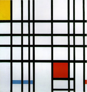


In this image, called Composition with Yellow, Blue, and Red, the lines represent streets from obviously a birds eye view of the streets of New York City. This painting is very abstract because there are no objects to represent any landmark or building within New York, or anywhere else for that matter of fact, and all we are left with are reasonably thick black lines which intersect each other in straight, often close lines which represent streets.

This painting was also created by Piet Mondrian in 1937-42.

22 Oct 2009

ART DECO

Art Deco

From 1925 until the 1940s, Art Deco was a popular international art design movement affecting the decorative arts such as architecture, interior design, and industrial design, as well as the visual arts including painting, the graphic arts, fashion and film. At the time, this style was seen as elegant, glamorous, functional, and modern. The movement was a mixture of many different styles and movement of the early 20th century,including Neoclassical, Constructivism, Cubism, Modernism and Futurism. The movement was a mixture of many different styles and movements of the early 20th century, including Neoclassical, Constructivism, Cubism, Modernism, Art Nouveau and Futurism.

It is characterized by the use of angular, symmetrical geometric forms. One of the classic Art Deco themes is that of 1930s-era skyscrapers such as New York's Chrysler Building and Empire State Building.

Another of many many Art Deco buildings is the City Hall of Buffalo. When approaching City Hall from Niagara Street, one is impressed with an architectural style which is modern without being modernistic and which depicts the age in which it was built. Also, it generally balanced its modernism with a taste of the symbolism normally associated with classical architecture.
The 32 story Art Deco building was completed in 1931 by Dietel, Wade & Jones.

24 Sept 2009

ROMANTICISM and REALISM


ROMANTICISM:
The image on the right is from the romanticism era. Called The Nightmare, it is a 1781 oil painting by Henry Fuseli.
There are many interpretations about this painting. The canvas seems to portray simultaneously a dreaming woman and the content of her nightmare. The incubus and the horse's head refer to contemporary belief and folklore about nightmares, but have been ascribed more specific meanings by some theorists. Contemporary critics were taken aback by the overt sexuality of the painting, which has since been interpreted by some scholars as anticipating Freudian ideas about the subconscious. (source wikipedia - http://en.wikipedia.org/wiki/The_Nightmare).


The picture on the right is called The Kiss and was painted by Francesco Hayez. It tells the story about a Risorgimento patriot, saying goodbye to his wife before going to war.

I love how he used dark colours to give it that more of a real feeling as if it was a photograph that was being taken.


REALISM:

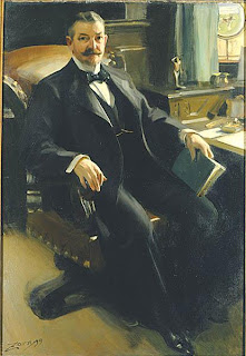
The painting below is called Mr Henry Clay Pierce created by Anders Zorn, and was painted in 1899. My interpretation of this painting is that Anders wanted to show the real life that people live and that getting a picture of yourself painted in your room with reasonably dark lighting was as real as it was going to get and not getting painted in a seemingly magical forest or on a moonlit balcony with a million stars lighting up the sky.


The painting on the right is called Bonjour, Monsieur Courbet, and was painted by Gustave Courbet in 1854. To me, I feel like the artist just wanted to show a normal day in his life meeting two friends along the way. I also noticed that he made it more real by using natural colours and not bright colours where there shouldn't be any.


17 Sept 2009

Influences 1


The image on the right is off a main character in a game series called Metal Gear Solid. The creator of this character is called Yoji Skinkawa. This design has been reused and edited again and again by other designers for various spin-off games.
The design for this character was heavily influenced by the appearances of certain celebrities. For example, the very first design for this character (who is called Solid Snake) resembles an actor called Michael Biehn. The picture below shows this:

On the right hand side of the picture is the very earliest image of Solid Snake that we ever see. The design looks almost identical to the actor on the left hand side who is called Michael Biehn.


Another character designed by Yoji Shinkawa which has been influenced by real life actors is this image on the right:


Once again, this artist has designed another character's looks on the appearance of Sean Connery. This is a classic example of heavy influence.